User
Experience
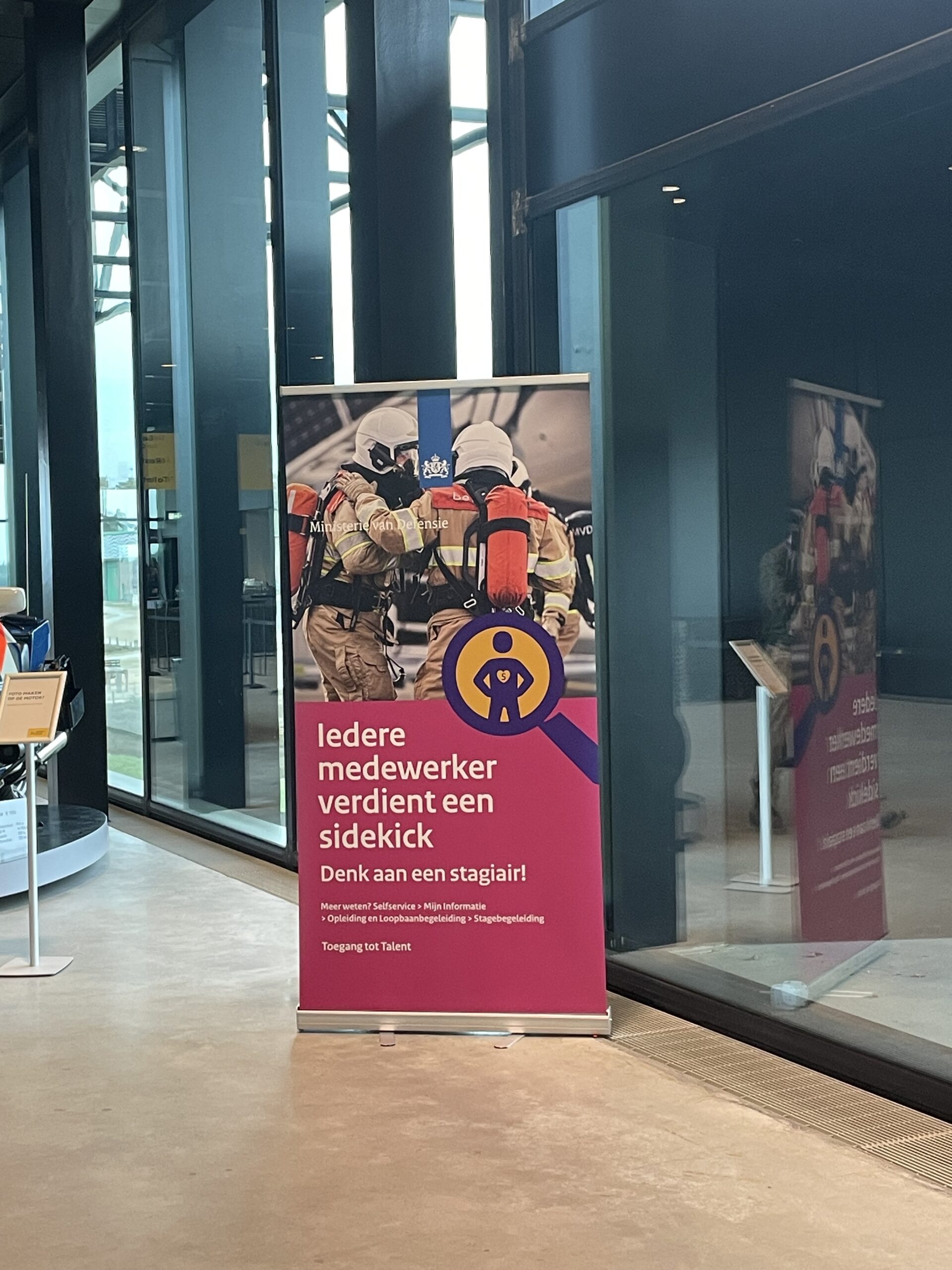
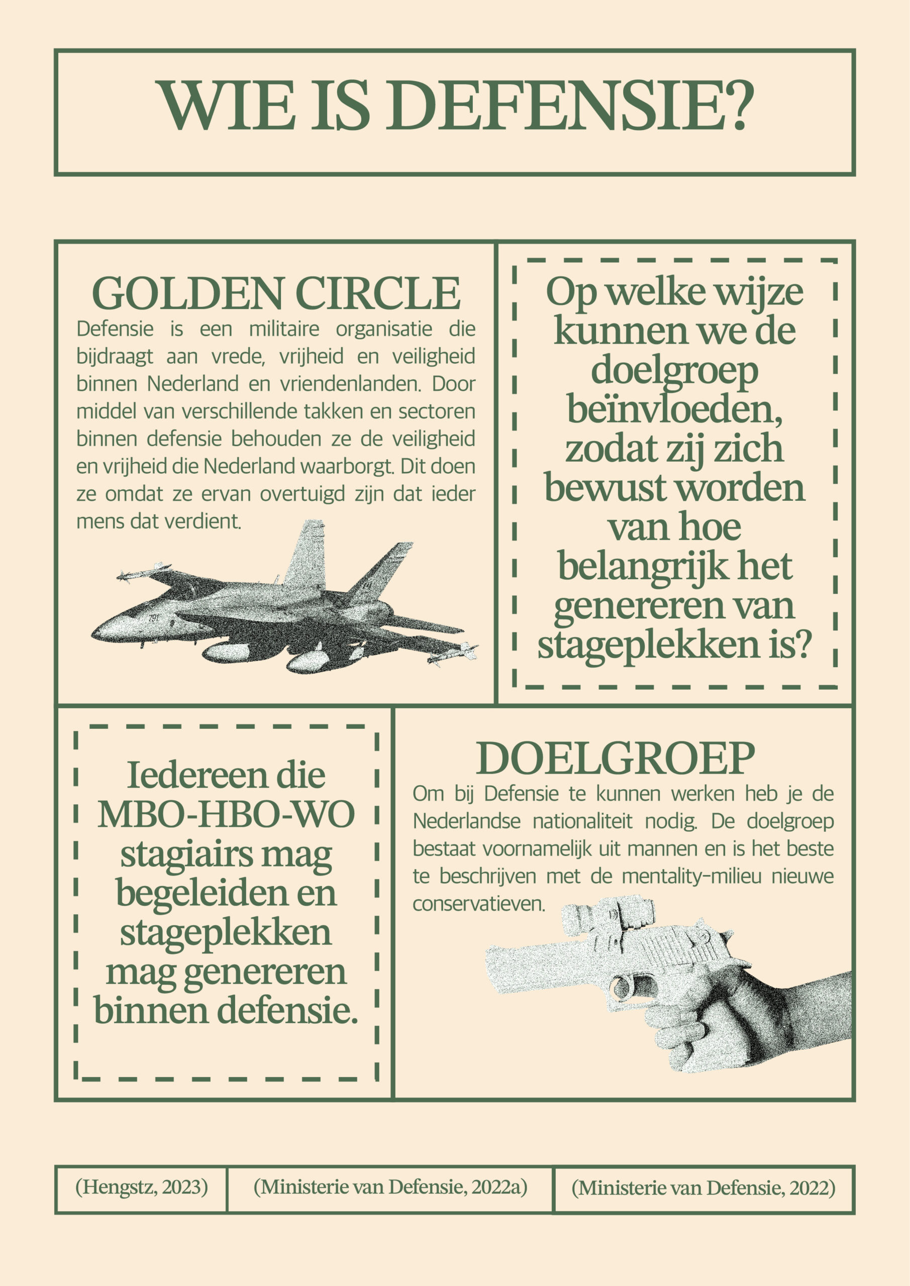
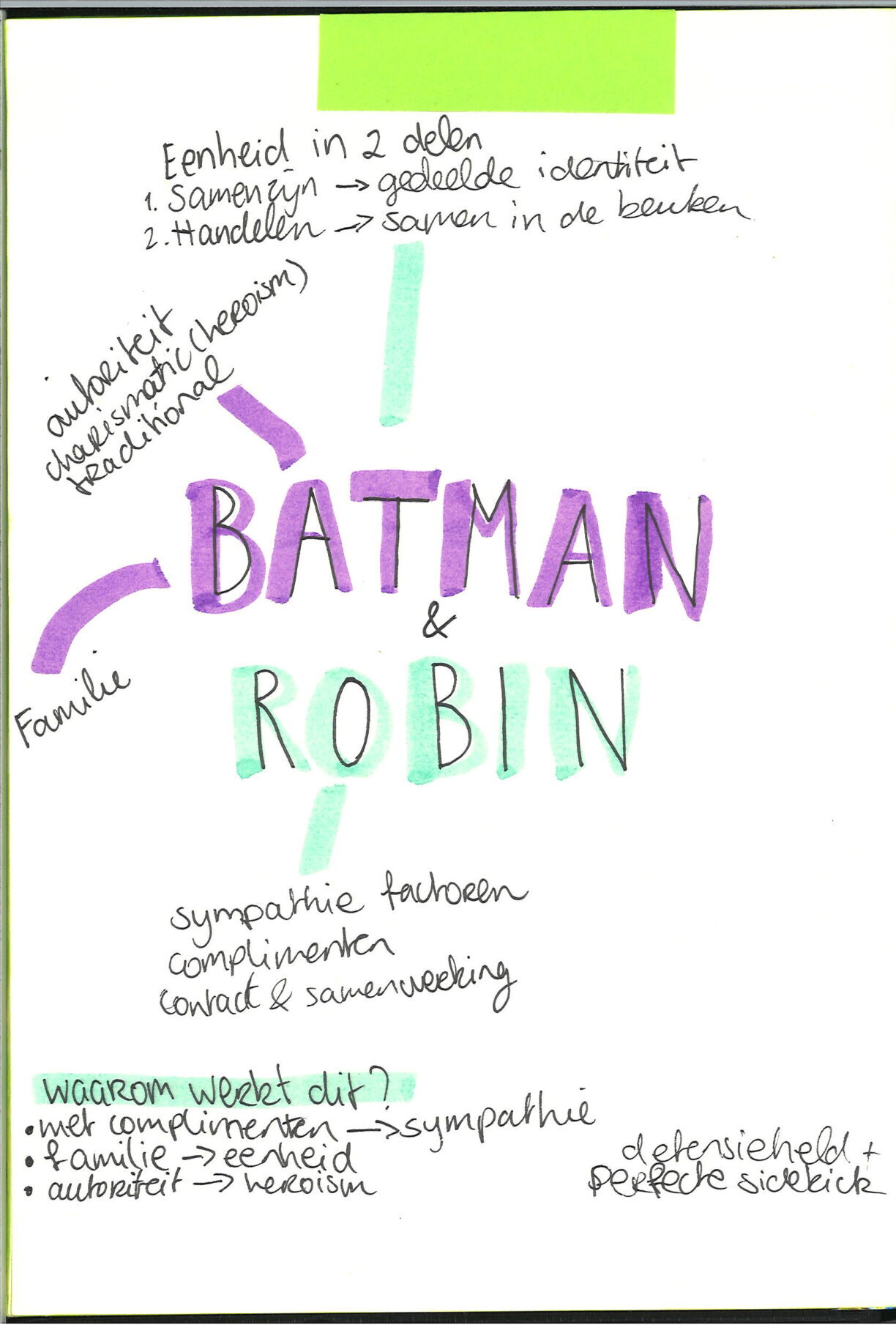
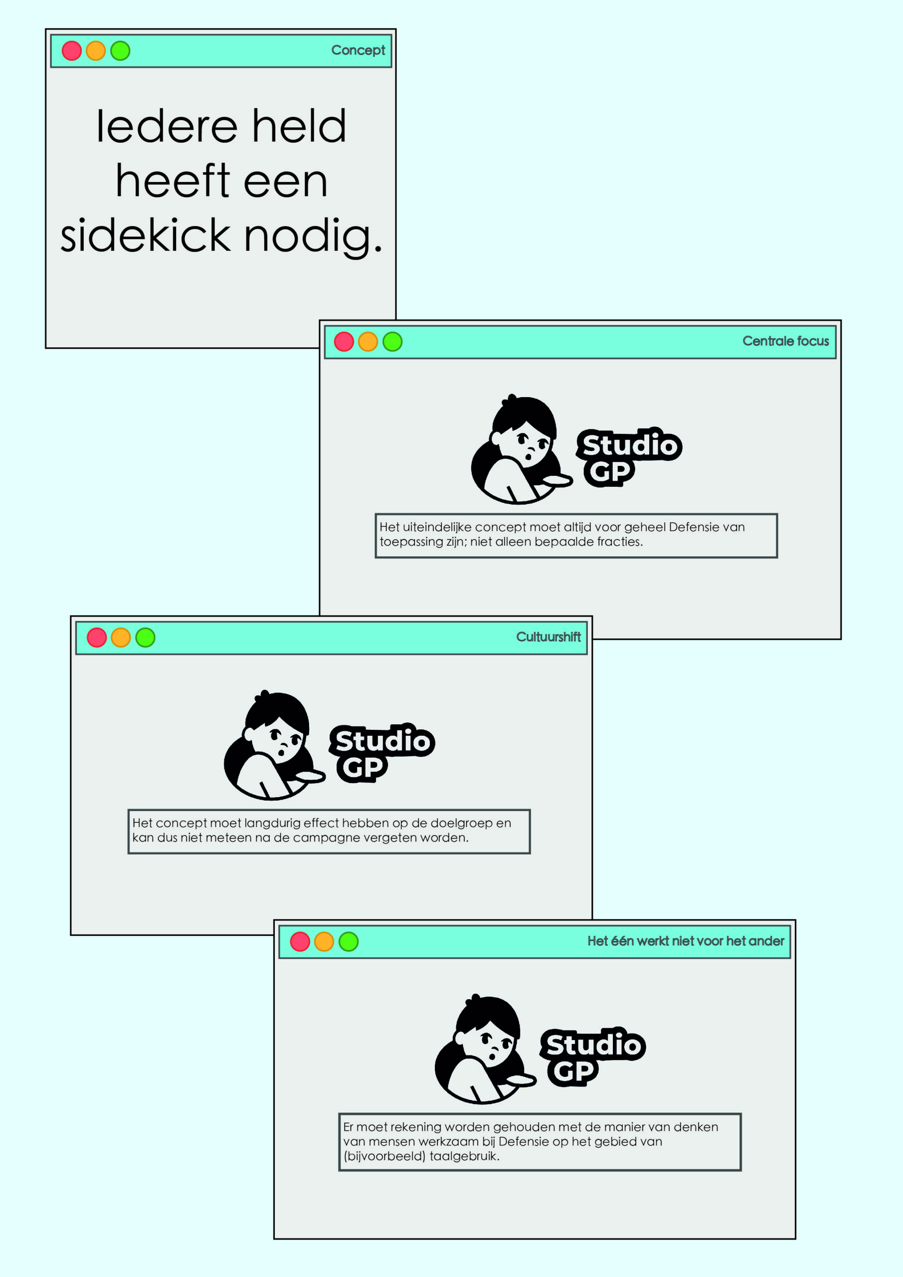
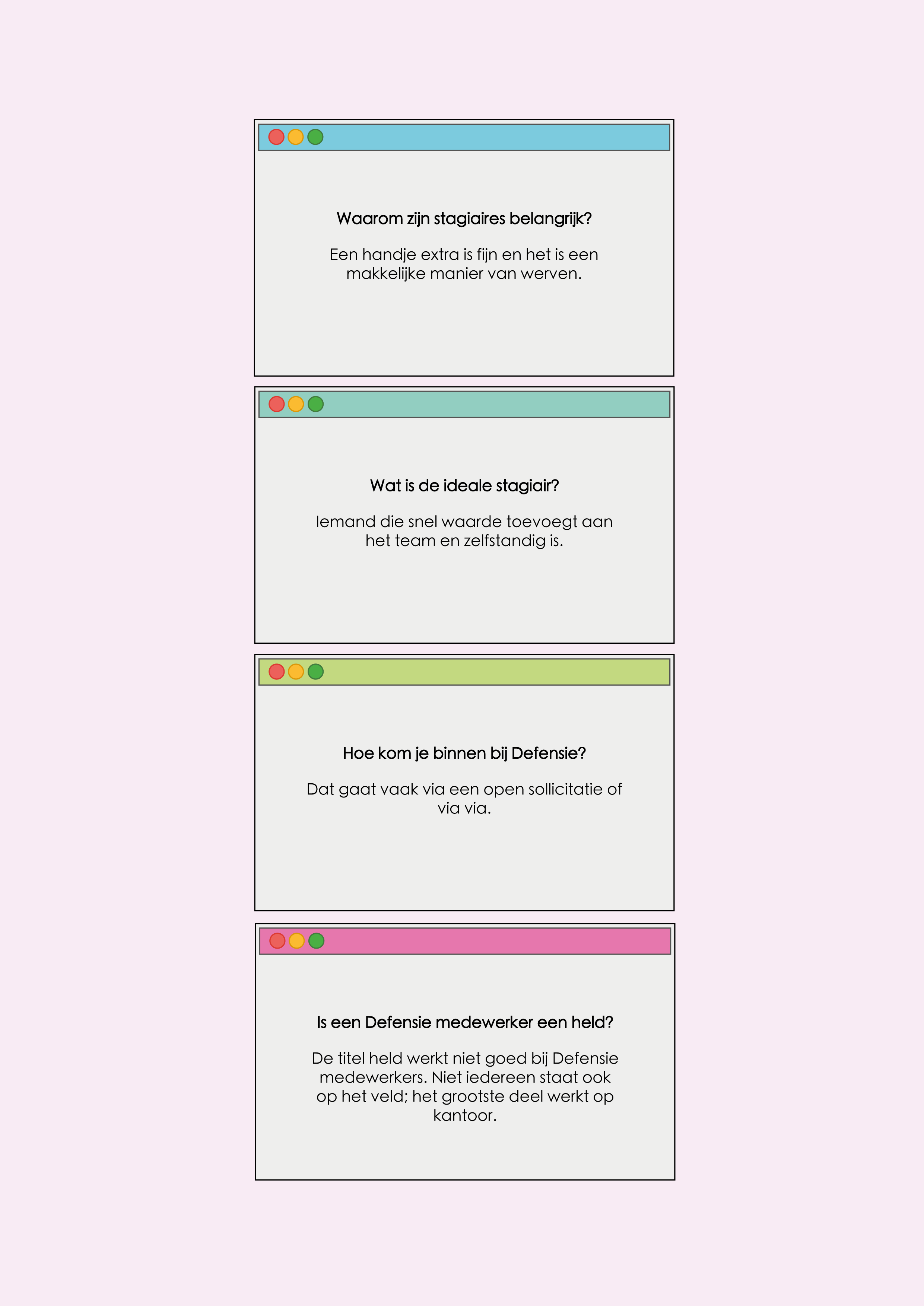
Back in 2023, the Dutch military had an assignment for us for internal use. Defensie, had trouble getting interns, due to the employees thinking that guiding someone would be a lot of effort and time. The client asked us, to come up with a campaign to convince employees to hire more interns.
In this project, we all got different roles. We work with Understand, Create and Deliver. I was in charge of Understand, which is all the research. Together with my team, I came up with the concept, ‘all heroes need a sidekick’. With the use of different persuasion methods, we were able to create internal motivation from the target audience. Defensie used this idea within their company.
Being in charge of the research, gave me the responsibility of finding out what we needed to research, how we needed to research it and who was going to research it. Thinking of brainstorming methods, and documenting everything nicely was also part of my job. I tried to make a lot of visualisations, also for my teammates so they had an easy overview.
Here I realised how much I actually enjoy research. Later during my internship, this was again confirmed and made me want to continue that journey of trying to become better and elevating myself as a researcher.
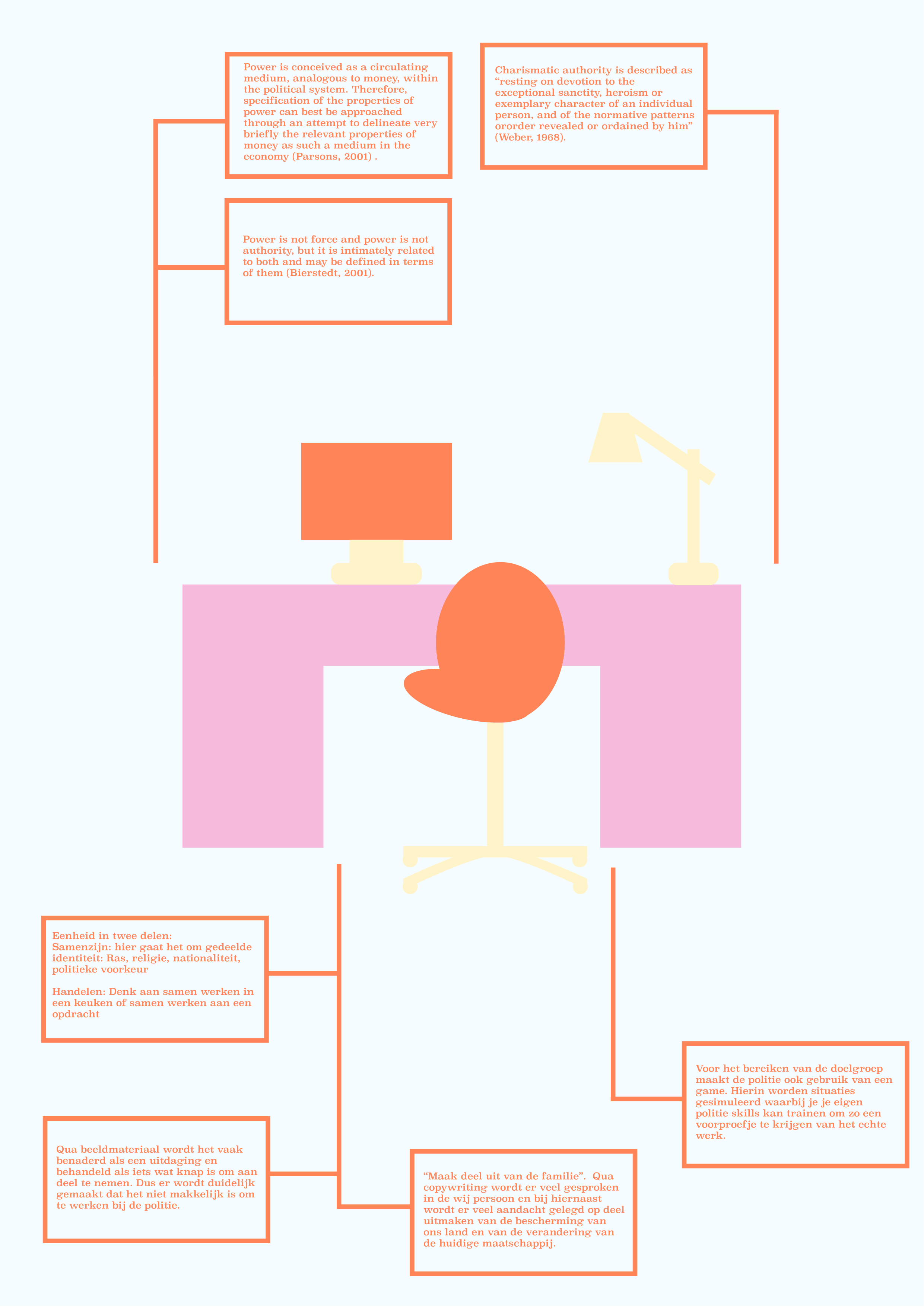
With the pictures, you can slide through my process on this project. You will find a page from my sketchbook, where we made the concept. You will also find a golden circle, our Guiding Principles, desk research and some contextualisation. There is also a picture of the banner that Defensie made, based on our campaign.


In 2024 I did a UX internship at Fastned. Fastned is a company that builds fast charging stations, to make the transition to electric driving easier. The goal is to do this by building stations where you can charge an EV within twenty minutes, and continue your journey. We are all busy humans.
During my internship, I got the assignment to redesign the screens displayed on the chargers, if there were no limits. There are currently quite some limits as to what is physically and technically possible on the screens, but in a perfect world, Fastned could design the whole flow. For me the assignment came to make a sketch based on research, taking in opinions of all the stakeholders.
The research was the best part. I was doing a good job and I had a lot of fun doing the research. My parttime job is at Fastned, and that is why I also decided to do my internship here for my studies. I am a Customer Support Agent, and know exactly what the customers want. Using that research, I started with desk research. Pretty quickly, I decided to go into the field and interview customers on different stations. Using data, I checked the busiest stations in certain hours, and got a wide range of different customer types. People that charge often, people that drive for work, but also people that only charge on the way but for the rest they use the charger at home.
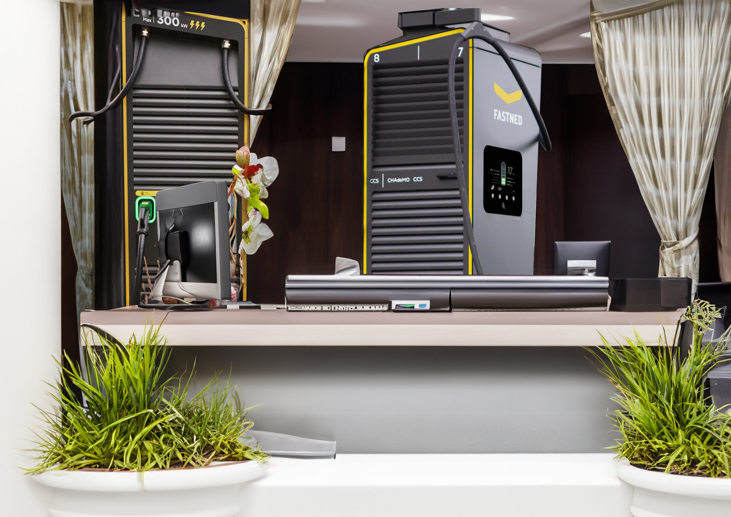
I ended up with a concept that I like to describe as using the screens as a hotel receptionist. It will hold your hand throughout the process if you’re new, but if you know your way around you can easily access more information. Based on the research I made ten priorities for on the screens. This was with feedback from the most important stakeholders. I made prototypes, tested those, and with the gathered feedback I went back to prototyping. Eventually I ended up with the ideal flow that Fastned can use when they see fit.
In the prototype you will for example see a flowbar in the top, showing you where you are in the process, so you know how long to go. You also see all the payment methods explained with illustrations. I later decided to get rid of the explanation, because illustrations should speak for themselves.
